

Health Wins
Health Wins, an exclusive membership concierge health plan for college students, seeks to revolutionize the way young adults access healthcare services. With the goal of seamlessly integrating healthcare into their daily lives, the project aims to develop a comprehensive visual design system. This initiative will not only make medical services more accessible but also ensure a consistent and recognizable brand presence across all digital and print platforms, truly embodying the brand's values of support, wellness, and accessibility.
Skills
Brand analysis
Comparative analysis
Sketching Style Guide Design
Icon Design
User Interface (UI) Design
Wireframing
Tools
Figma
Project Timeline
Mar2023-May 2023 (6 weeks)
Program and Role
California College of the Arts
Interaction Design | Visual Design | Professor Roderick Lemaire
Merma Ma (UI Design)
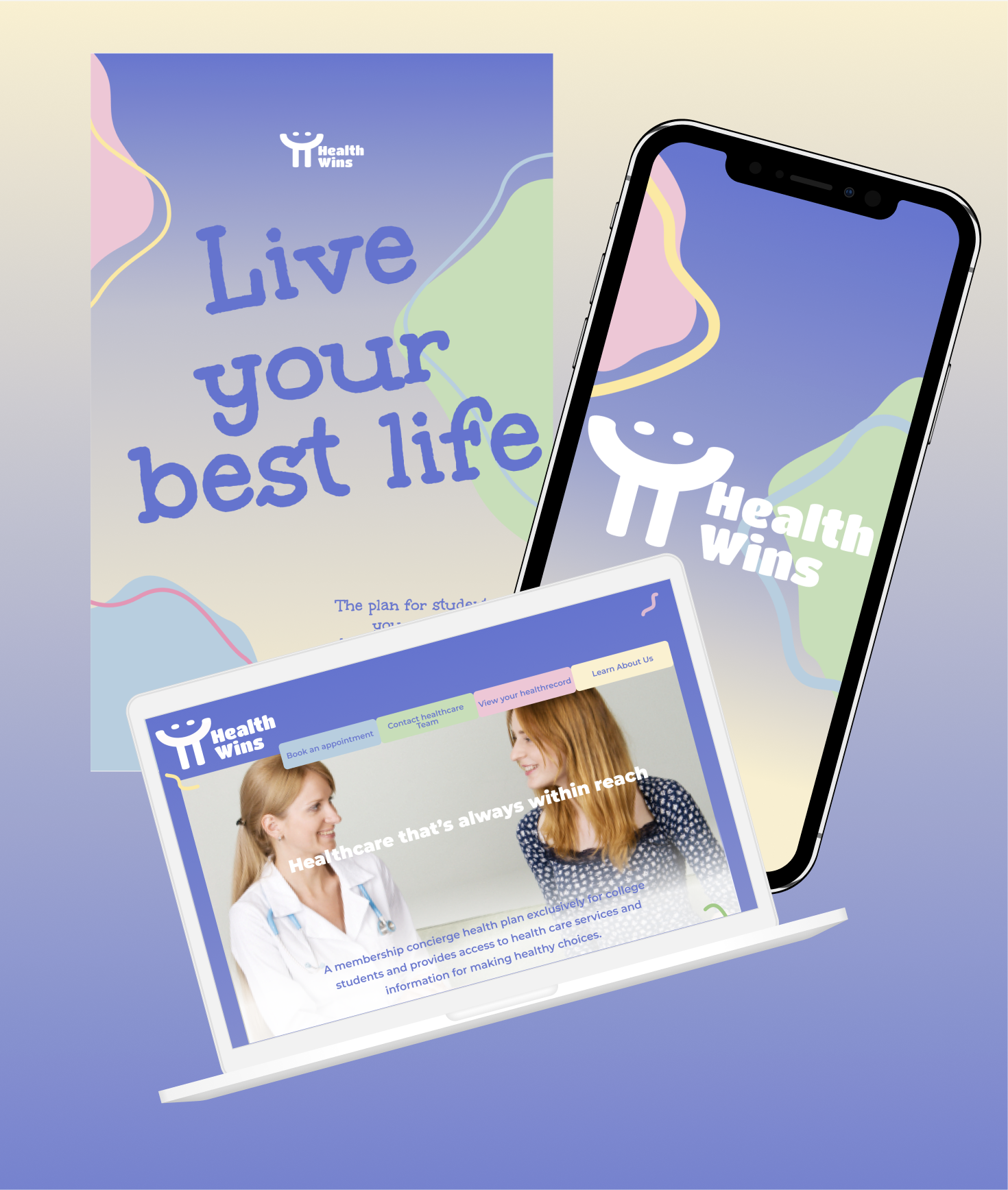
Health Wins is a membership health service designed exclusively for college students making healthcare feel accessible, not intimidating. My goal was to build a visual identity system that could live consistently across every touchpoint: logo, typography, color, web, mobile, and print. Because when a brand feels fragmented, trust breaks down especially in healthcare. The design needed to feel warm and approachable for students, while still being credible enough to represent a real medical service.
Brand analysis

Health Wins strategically positions itself as a trustworthy ally in college students' health and wellness journey by promoting accessible, personalized, and affordable healthcare services. The brand's core promise "Healthcare that's always within reach" resonates deeply with its target audience of 18-24-year-olds, fostering a connection through values of inspiration, approachability, privacy protection, and resource availability. Health Wins crafts a professional yet warmhearted brand personality, aspiring to motivate and support students in actively managing their health, aligning with their need for reliable yet simple healthcare solutions.

Brand Positioning
The"Healthcare that's always within reach."

Brand Value Proposition
Health Wins is built around approachability and trust personalized coaching that meets people where they are, and makes the path to better health feel achievable rather than overwhelming.

Motivational
Professional
Warmhearted
Affordable
Active
Brand Personality
Competitive analysis


Timely Care owns the student health space expertled, techforward, but narrowly focused. Healthbridge leans into personalization and specialized medicine, but reads as clinical and professional rather than welcoming. Health Wins sits in the gap both miss: broad enough to serve beyond one demographic, warm enough to not feel like a doctor's office.
Moodboard

Urgent / Efficient / Convenient High visual density and saturated contrast, every element is fighting for attention, which is exactly the point. No breathing room, no hesitation.

Motivational / Accessible / Welcoming / Encouragement Soft curves, warm tones, handwritten type the visual language feels like it's meeting the user halfway rather than demanding anything from them.

The final direction works because every element agrees color, type, and imagery all point to the same feeling: approachable, warm, and personal without being overly playful. The soft multicolor palette keeps the tone inclusive and lowpressure. Handwritten type adds personality without losing legibility. Compared to the first board which felt too intense and the third too corporate, this one holds the middle ground without feeling like a compromise.

Active / Motivational / Professional Blue and yellow at full saturation, tight grid, bold type, energetic but controlled. The structure gives the motivation somewhere to land.
Logo Design+Moodboard


Urgent / Efficient / Convenient Heart and cross combined the logo communicates medical credibility instantly, but the sketchy line weight keeps it from feeling cold.
Active / Motivational / Professional The "H" with a stethoscope stays legible at small sizes and reads as professional without overexplaining what the brand does.
Motivational / Accessible / Welcoming Embedding a smile into the "H" is a small decision with a big tonal effect the brand feels human before anyone reads the name.
The smile embedded in the "H" does the brand's job before any copy does approachable and positive without needing to say it. The form is simple enough to hold across sizes and backgrounds, and the gesture reads universally, which matters for a health brand that needs to feel welcoming to everyone.
Style Tile

Unkempt Bold handles headlines the casual, almost handwritten weight signals friendliness before the content does. Montserrat keeps body copy clean and legible, grounding the system without competing. The soft multicolor palette was a deliberate choice to lower the anxiety that health-related content can trigger nothing clinical, nothing alarming. Wavy graphic elements and approachable photography carry that same warmth through every touchpoint.


