
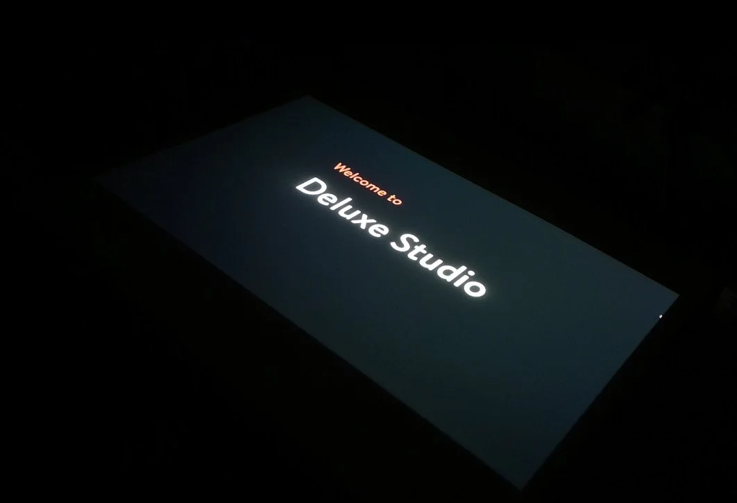
Deluxe Studio
Interior designers and homeowners speak different languages. Designers work in blueprints and material specs. Homeowners think in feelings and lived experience. The result repeated feedback loops, rejected ideas, and frustrated clients.
Deluxe Studio is a tangible codesign tool that makes abstract design decisions visible and collaborative in real time.
Skills
Journey Mapping
User-Centered Workflow Thinking
Sketching Style Guide Design
Scenario-based UI Framing
User Interface (UI) Design
Wireframing
Tools
Figma
Planner 5D
Project Timeline
Mar2024-May 2024 (6 weeks)
Program and Role
California College of the Arts
Interaction Design | NUI and Objects
| Professor Graham Plumb
Merma Ma (Interaction Design and UI Design)
Research Finding
Both sides
were guessing.
The breakdown wasn't about taste. It was about the absence of a shared visual language at the exact moment decisions needed to be made.
Interior Designer
Couldn't match client expectations kept receiving feedback after decisions were already made.
House Owner
Couldn't visualize how abstract design choices would feel in their actual space rejected concepts they might have loved.
Critical Gap
Material selection stage was the highest-friction point neither party had a shared reference when making the most consequential decisions.

From Insight to Direction
Visualization
See it before committing
Clients needed to visualize how materials, lighting, and furniture would look together in their actual space before any decisions were locked in.
Communication
Show tradeoffs clearly
Designers needed a structured way to present material choices in terms clients could evaluate and compare not just approve or reject.
Confidence
Decide together
Both sides needed a shared reference point to make decisions in the same moment, not in separate feedback loops after the fact.
Design Process- Three rounds of iteration
Prototype -First Version
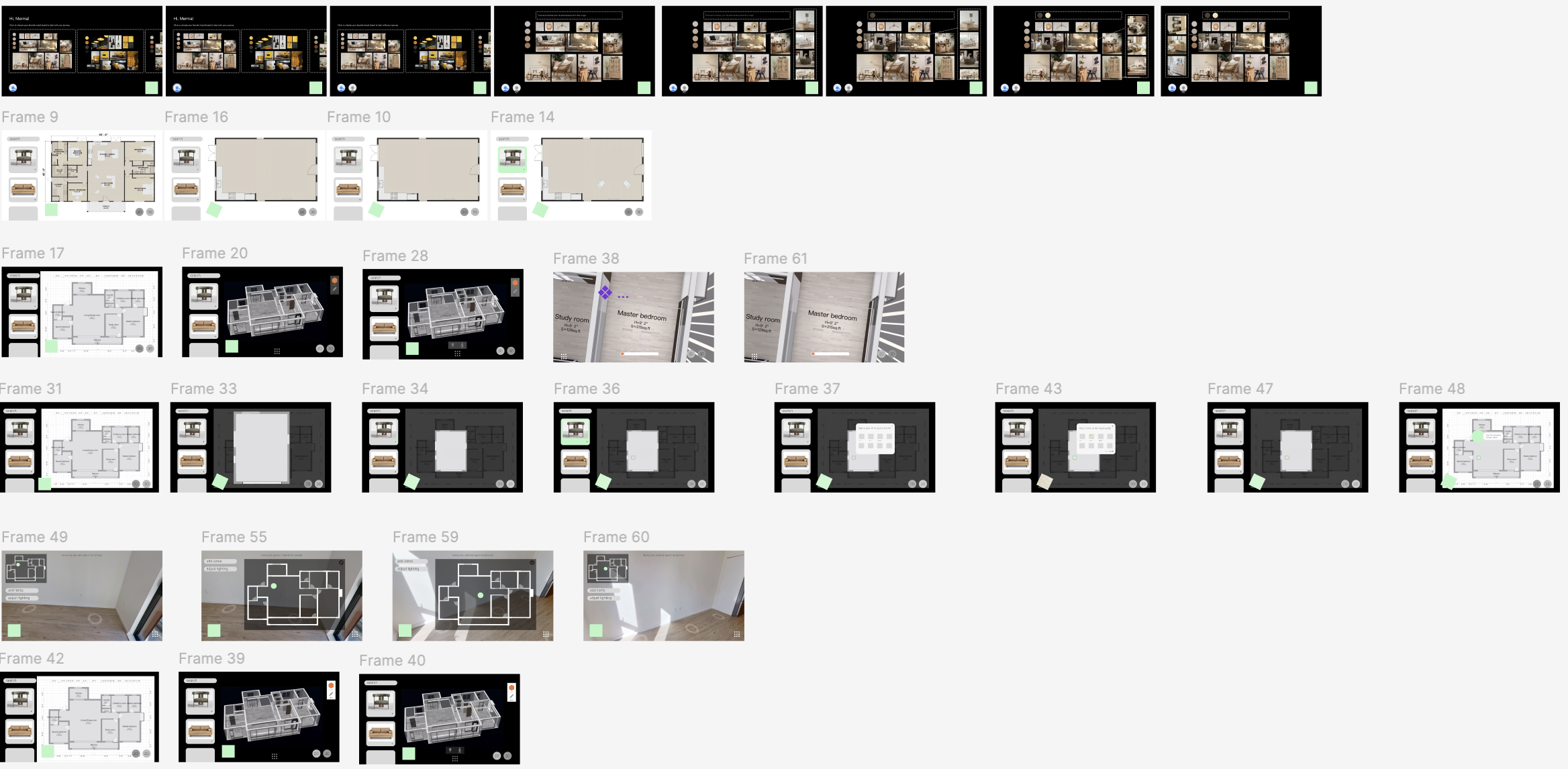
What I built
Feature based interface organized around what the tool could do rather than how users would move through a session together.
What I learned
The interface felt like a feature menu. Users couldn't see a clear path from inspiration → spatial planning → material selection.
Prototype -Second Version
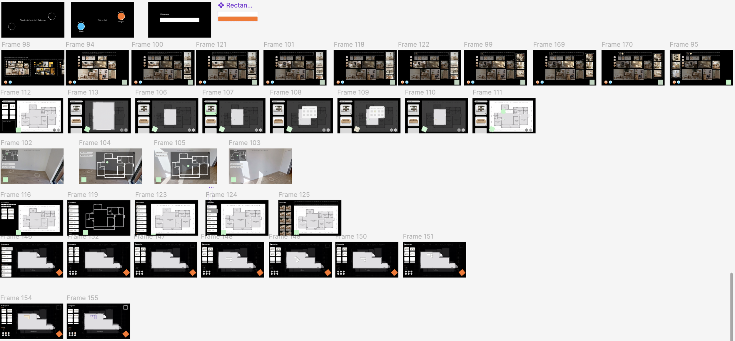
User said
Feature based interface organized around what the app could do rather than how users would move through a session together.
I decided
Separate control interfaces for designer and homeowner. Rebuilt IA around the actual sequence of a real design session.
Why it mattered
The interface felt like a feature menu. Users couldn't see a clear path from inspiration → spatial planning → material selection.
Prototype -Final Version
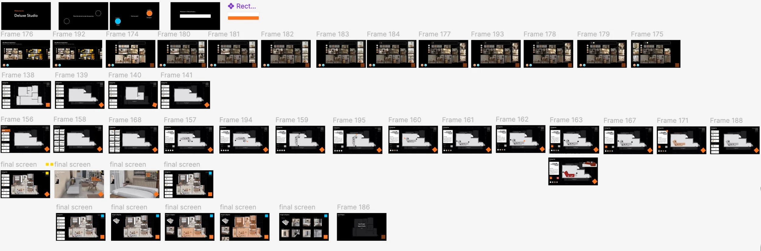
User said
The prototype still felt unnamed and unfinished reviewers couldn't describe the product or its positioning to others.
I decided
Named the product 'Deluxe Studio', introduced a branded splash screen, and applied a consistent orange accent system across all final screens.
Why it mattered
A clear brand identity anchors all design decisions to a north star and makes the product feel real, not just a concept.