

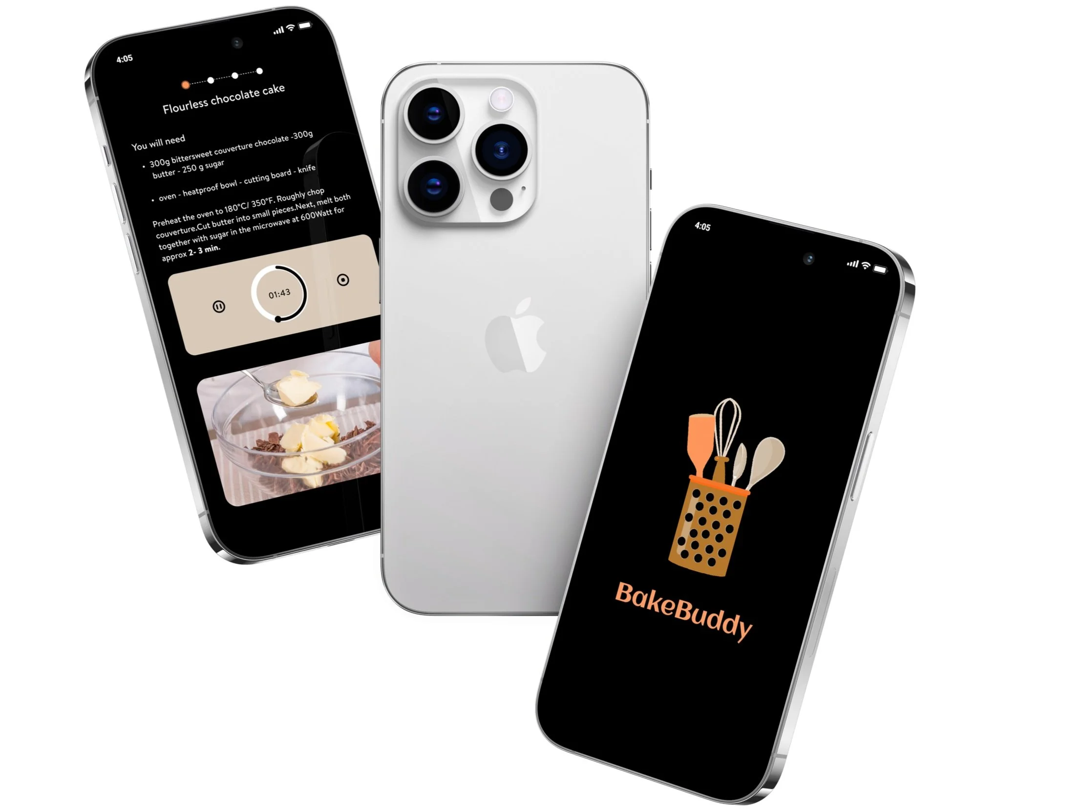
BakeBuddy
When you're cooking, your hands are never clean. Traditional recipe apps force you to touch your phone to scroll, pause, or set a timer breaking your flow every single time.
BakeBuddy is a gesture controlled recipe app that uses the iPhone's camera to recognize in air gestures, letting you cook without ever touching your screen.
Skills
Design Research
Prototyping
Sketching
Style Guide Design
Usability Testing
User Flow Diagramming
User Interface (UI) Design
Wireframing
Tools
Figma
Adobe After Effects
Project Timeline
January2024 - March2024(6weeks)
Program and Role
California College of the Arts
Interaction Design | NUI and Objects
| Professor Graham Plumb
Merma Ma (Interaction Design and UI Design)
The Problem
The problem isn't that people can't use recipe apps while cooking. It's that every interaction requires them to stop, clean their hands, and touch the screen then get back to cooking. That friction adds up.

How might we design a gesture-controlled recipe app that uses the iPhone's camera to recognize gestures, making cooking more intuitive and enjoyable, while ensuring it's easy for users to learn and reduce cooking errors?
Introducing BakeBuddy
Design Process

I observed and recorded natural gestures during conversations to understand which movements felt instinctive.
Users had strong existing associations between gestures and actions swipe meant scroll, open palm meant stop. Any gesture system that contradicted these mental models would require too much learning to feel natural in a kitchen.

Researching Gestures
Representing Gestures


I rapidly sketched and tested gesture concepts against two criteria: could users guess what the gesture did without being told, and could they reliably repeat it with messy hands?
The biggest challenge gestures needed to work across different cultural backgrounds no gesture could rely on language or regional convention to be understood.
Echo and Semantic Feedback
User Flow Diagramming
I Decided
Added two layers of feedback: immediate visual animation confirming gesture detection, and semantic feedback showing what action was triggered.
Why It Mattered
Without feedback, users repeated gestures more aggressively, creating errors. Clear confirmation let them cook confidently without looking at the screen constantly.
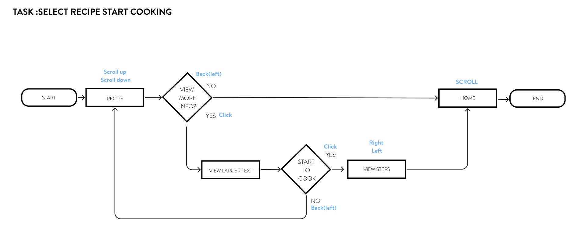
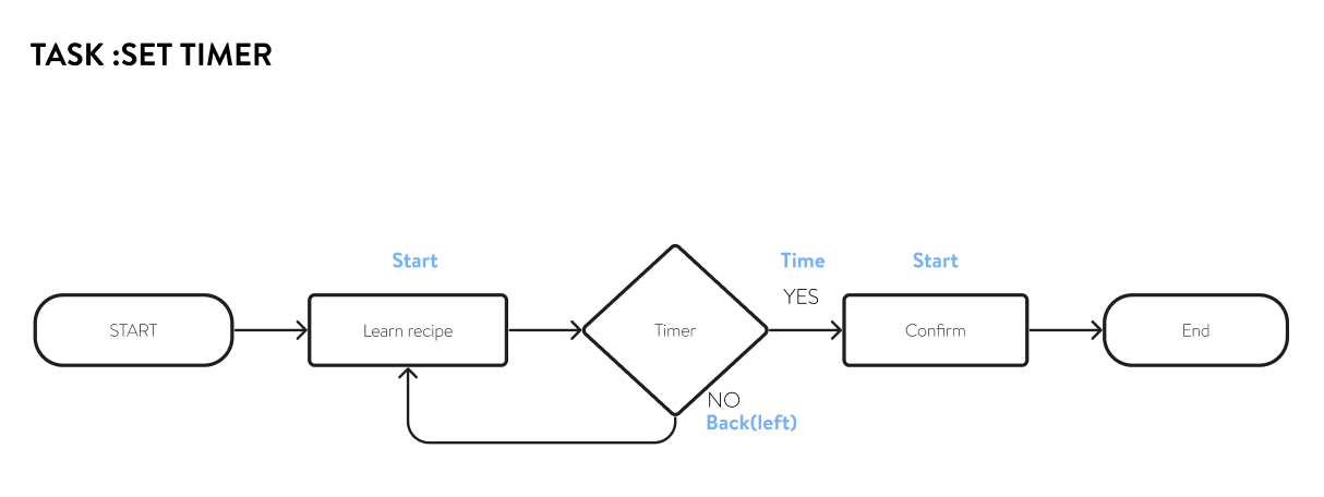
By utilizing user flow diagrams, I clarified the product's navigation flows and potential steps, enabling me to pinpoint and resolve potential user roadblocks, optimizing for a seamless, user-centric experience.


Wireframe
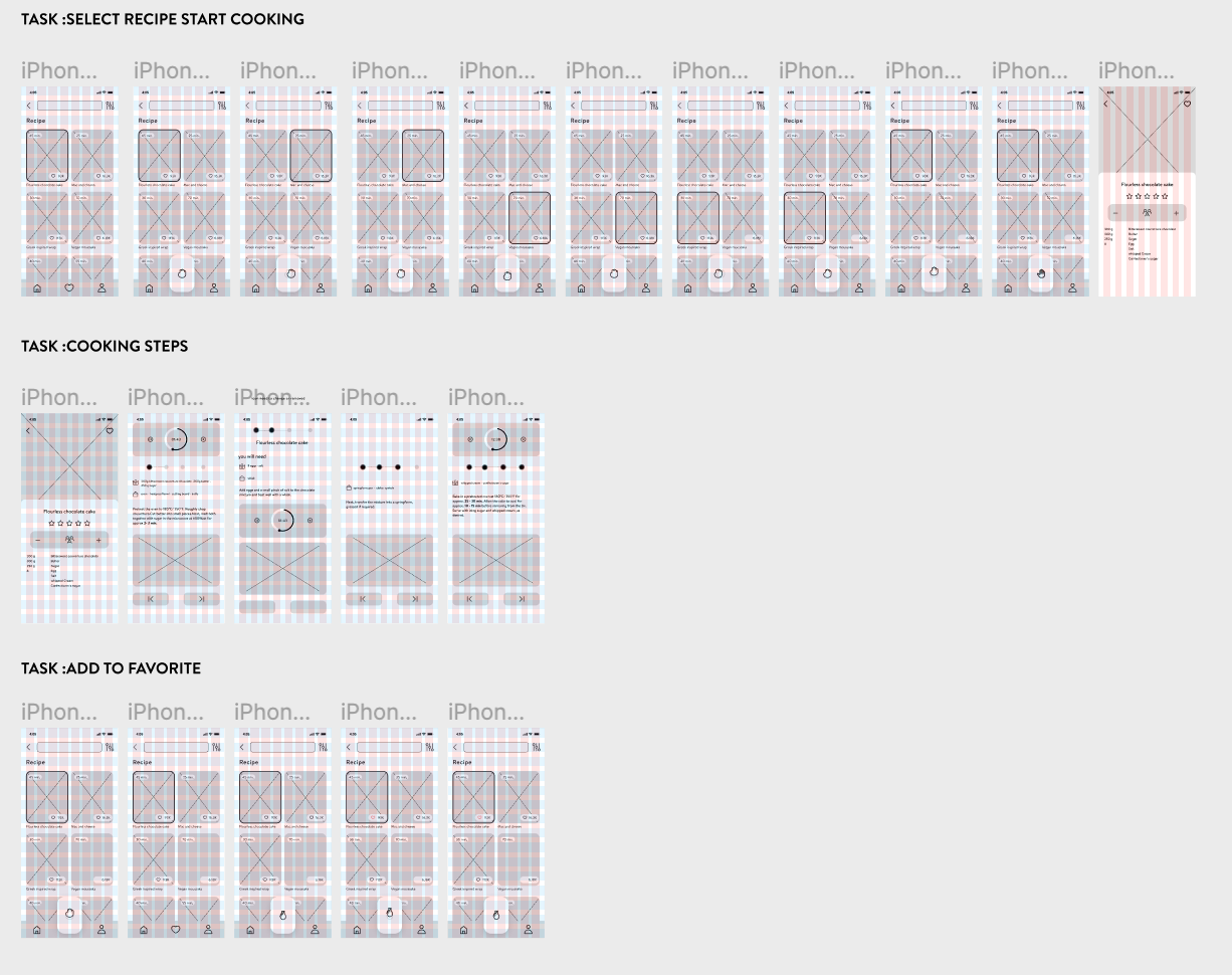
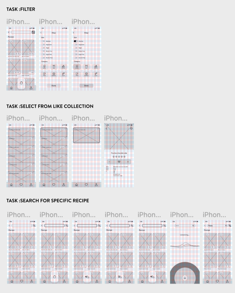
By creating wireframes, I can clearly define the functionality of the app, ensuring that the layout includes all necessary components. This approach makes the iteration process of the design both simple and cost-effective, as wireframes are relatively easy to create and modify. As a fundamental step in the early stages of design, wireframes provide a clear architectural blueprint for my app. By stripping away complex design elements such as colors and images, they help me focus on optimizing the layout structure and the relationships between pages, as well as functionality and user flow. Doing so not only ensures that users can navigate in a logical and efficient manner but also allows me to clearly communicate my design intentions and plans to others. More importantly, wireframes enable me to test the navigability and usability of the interface early in the project.

Style Guide and Branding

The final step in refining the BakeBuddy concept involves developing its style guide, which consolidates the product's aesthetic into a unified visual identity.

When creating the style guide for a cooking recipe application with a theme of enthusiasm and vitality, I chose orange as the color for the call-to-action buttons, set against a black background to establish a bold visual identity. Orange, symbolizing energy and passion, was selected as the primary brand color to evoke the joy and excitement of cooking for the users while using the app. The black background provides strong contrast, making the orange color stand out even more. Meanwhile, I utilized white space to create a more comfortable and refreshing visual effect, with the orange accents in white popup backgrounds particularly eye-catching, serving to emphasize key content.
Usability Testing and Revisions

Key Takeaways from User Testing
Prompts at the top, gestures at the bottom had to split attention between two areas.
Animations resolved too fast feedback arrived before the gesture had fully landed.
Cook time appeared before instructions, working against how users naturally read a recipe.
Utility and ingredient icons required decoding, not recognition.
The liked collection worked at small scale were already asking for filters.
Overlapping cards made saved recipes hard to locate position became unpredictable.
"Tutorial" set the wrong expectation anticipated a lengthy process before they could do anything.
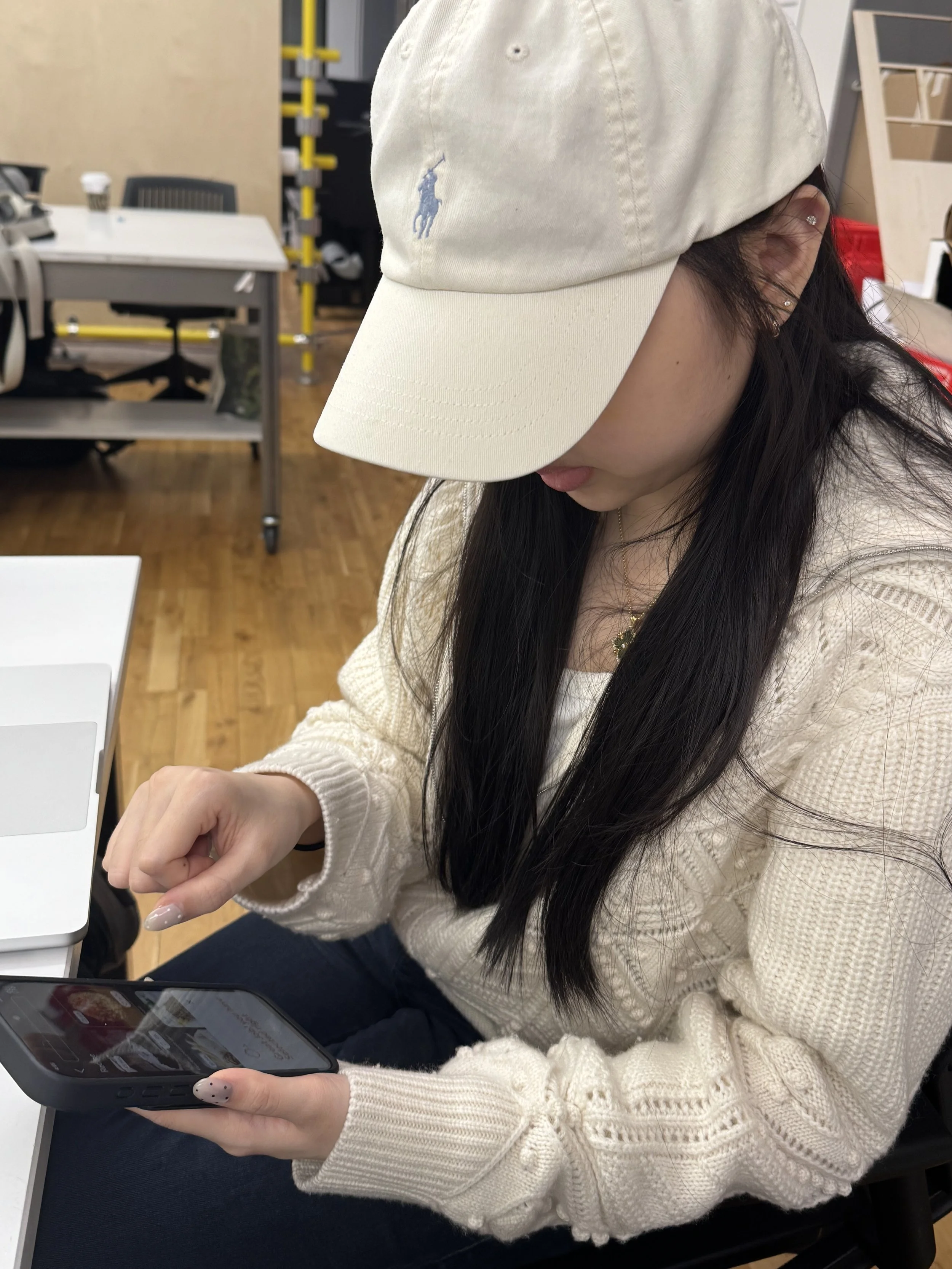
User testing at this stage was structured around a script to keep sessions consistent — same tasks, same questions, so the feedback was actually comparable across participants. The goal wasn't just to spot problems, but to understand where the interaction felt unclear versus where users simply needed more time to adjust.